How to use LAN messenger? Full 2024 guide.
1. Main Reasons to Choose LAN messenger for Businesses and Organizations.
There are many different messaging applications such as WhatsApp, Viber, Telegram, and others for communicating with friends and colleagues. However, when using these applications in the workplace, security issues should be considered.
Different messengers use their own servers located around the world to process and transmit data. This poses a risk of leaking confidential information and trade secrets. Possible threats when using these applications in a work environment include Trojan viruses, data encryption, sharing trade secrets with competitors, and disclosure of confidential corporate information on the Internet.
When choosing a messenger for work, attention should be paid to its security, convenience, level of data encryption, and ability to control access to information.
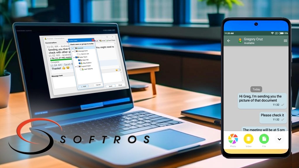
Using popular internet-based messengers in the work environment can lead to risks of confidential information leakage and other security threats. Softros LAN Messenger is a more reliable and secure solution for messaging and file transfer, while also providing high-quality video chats and calls. This application allows effective communication with colleagues and partners within the local network without routing traffic through external servers or the public internet. Avoiding external networks provides additional protection from potential cyberattacks that could compromise sensitive corporate data. The self-contained nature of Softros messaging program architecture enhances privacy and security for communications.
2. What is a LAN Messenger application?
Softros LAN Messenger app is a specialized messaging and data exchange software designed for use on local area networks (LANs). It provides users with the ability to exchange messages, create groups for communication, organize video and voice chats, transfer files, and even share their desktop screens with other users on the network. The application is available for Windows and macOS operating systems, and there is also an experimental version for Android mobile devices.
One of the key advantages of LAN chat software is its ability to work without an internet connection. This allows users on the same network to quickly and efficiently communicate with each other, even if the internet connection is unavailable or unstable. Such an application can help employees efficiently exchange information and collaborate on tasks without relying on the state of the internet connection or access to corporate email.
Installation and configuration of LAN Messenger is quite simple and does not require specialized IT knowledge. This makes it accessible to a wide range of users who do not have deep technical expertise.
In general, LAN Messenger is an efficient and convenient solution for organizing communication and data exchange within a local area network. Using this type of apps can enhance productivity for networked teams.
3. How to Install LAN Messenger?
LAN Messenger from Softros was designed to make the installation and configuration process in a corporate environment as easy as possible. This simplifies setting up a secure communication channel within a company. The developers have streamlined the installation process, from start to finish including final customization. To begin using the application, follow these steps:
Step 1: Download LAN Messenger from the official website. This is the most reliable download source, as some websites may modify the files or provide cracked versions that are insecure or contain viruses. For Windows, .exe and .msi installation files are available. The .msi is convenient for silent installs on multiple computers without user intervention.
If you prefer Microsoft store, visit the LAN app page here. For macOS, download the .dmg file. To try the free Android version, use the provided link to the Google Play page, or search for the app directly.
Step 2: Once downloaded, double-click the installation file to launch the setup wizard. Click "Next>" then "Install." The PC chat application will install within minutes.
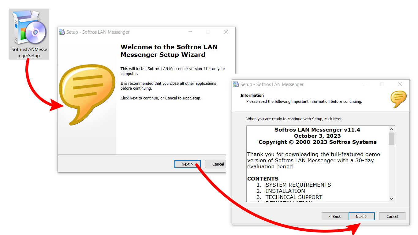
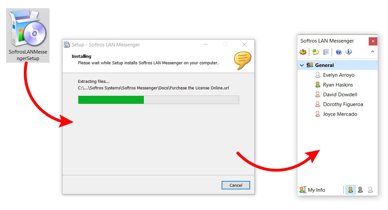
Once installation completes, check the "Run Softros LAN Messenger" box and click "Finish" on the final screen.
The main application window will then open minimized in the corner of the screen.
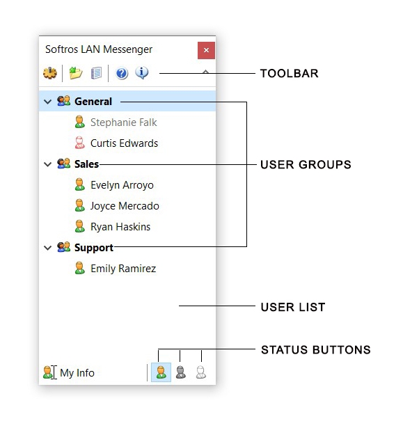
4. Main Window and Its Features.
The main window interface allows you to instantly see all users of your local network who have installed the application on their devices and are connected to this network. Only those users who are in your contacts list are displayed. The program's interface is compact, simple, and intuitive, yet packed with features. The application includes all the necessary functions without distracting with a lot of elements, which makes it convenient to use even for inexperienced users.
5. How to Use the LAN Messenger
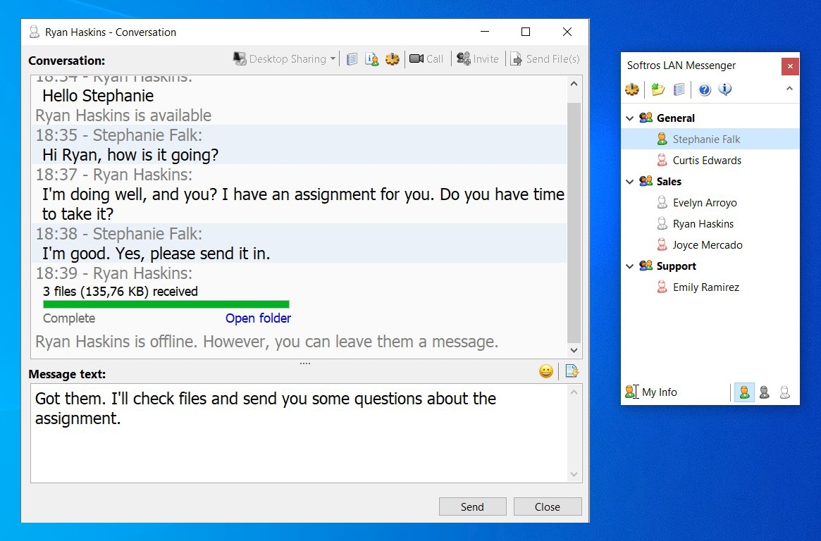
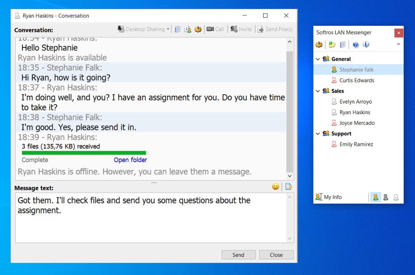
To start direct messaging with another user, simply click on their name in the main application window. This will open a chat window where you can start sending messages. You can write any amount of text and as in any standard messenger, you can view sent and received messages, their delivery status, use emojis and insert images through the copy and paste function, quote part or all of the message, according to your wishes. In this window you can transfer files and start video conferences with your interlocutor.
6. How Do I Start A Video Chat Over A Local Network?
To initiate a video conference, click on the username in the user list as you normally would in a text conversation. Then click the "Call" button in the message box. In the call window, you will see options to join the call. Click on any button of your choice and join the call. On the recipient's side, a similar window will pop up with a selection of devices to join the call.

Once the recipient selects a device, the video call will start. During the call you can turn on/off your camera, speakers or microphone from the top menu of the call window. To add more users to the conference, simply click the "Invite" button and select new video chat participants.
7. How to Send Files From One Computer to Another Over a LAN?
Softros LAN Messenger is an efficient and convenient solution for transferring files on local networks. This application provides fast data transfer and allows users to send an unlimited number of files of different types and sizes. Whether it's a document, image or video, there are no restrictions on the types of files that can be transferred using this application. Users can choose one or more recipients for their files, making file sharing even easier and more convenient.
7.1 How to send a file to one user?
To send a file to a specific user, open the private chat window and click the "Send Files" button in the upper right corner.

You can then select the file via Windows Explorer or simply drag and drop it onto the chat screen. Use whichever method you prefer. The application supports drag and drop, which allows you to select multiple files or even an entire folder and automatically send its entire contents to the right user.
7.2 How to send files to several users at once?
Instead of sending the same file to each user individually, you can use this application to send a file to a group of users at once. First, add all the recipients to the opened chat window by clicking the "Invite" button and selecting the desired users from the pop-up window.

Now all these users will be added to a single chat window.

You can then send the file to all added users at once, using the same methods as when sending a file to a single user. This approach greatly speeds up and simplifies the process of file transfer to a group of users.
8. How to Create and Manage Chat Groups?
The above method of adding users to the chat window creates a temporary group where all selected users will chat and you can easily transfer files to them. This is one way to create a chat group, but it will disappear as soon as you close the chat window. If you need to send messages to a specific group of people or employees from selected departments on a regular basis, you can create persistent groups for them in the application window.
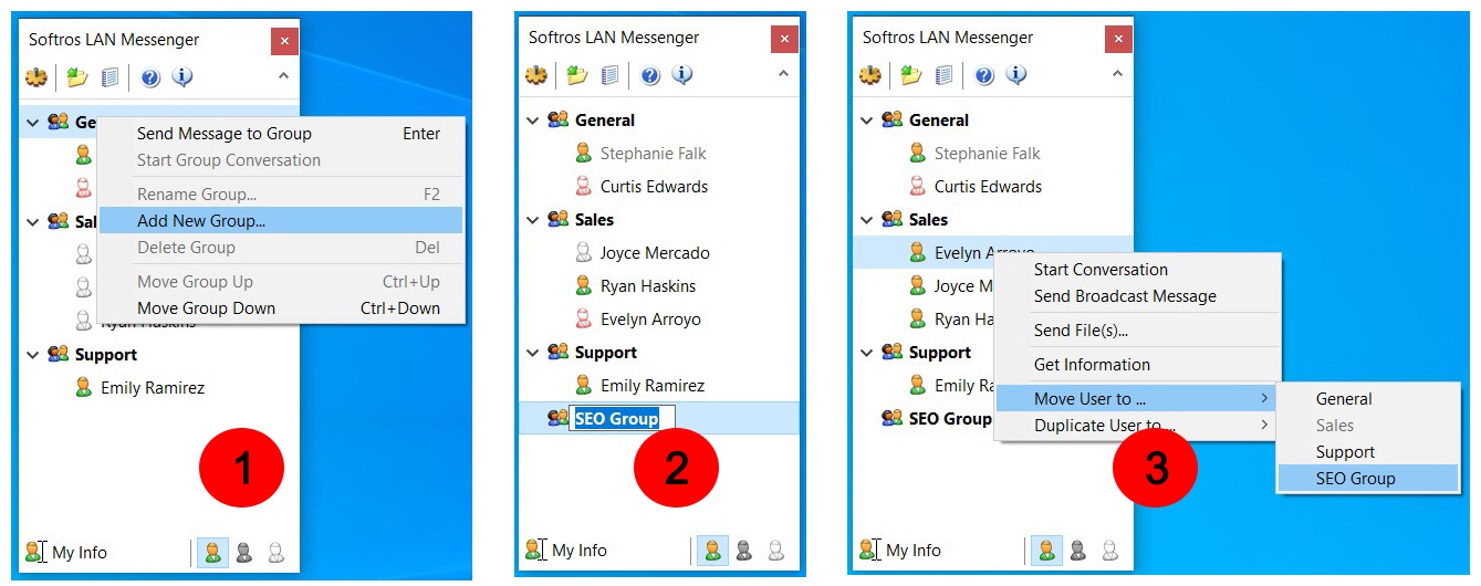
Creating a group is very easy. By default, all users are added to the General group. To create a new group, right-click on General and select "Add New Group..." from the context menu. This will create a new group - rename it to an appropriate name (e.g. SEO Group) and press Enter.
You can add any user to this group by right-clicking on their name and selecting either "Move User To..." to remove the user from the Sales group to the new group, or "Duplicate User To..." to keep them in the old group and also add them to the new group.
Now, to start a group chat, right click on the group name and select "Send Message to Group". A chat window will open and all members of the selected group will be automatically added to it.

Of course, you can add other users to the group chat window temporarily, for the duration of the current session.
9. How to Send Mass Messages Over the Local Network?
The office messaging app supports sending broadcast messages on the local network, which can be sent to any number of users simultaneously, regardless of their group membership. To send a broadcast message:
Right-click on the user and select "Send Broadcast Message". These messages are used for mass notification of an event, meeting or other important information. The main difference is that no one can reply to a broadcast message.
In the opened "Send Broadcast Message" window, select the users to whom the message will be sent (by default, all users are selected).
Enter the message text and click the "Send" button.
The message will be sent to the selected users and the "Broadcast Message" window will automatically close.

10. Get Remote Assistance and Screen Share Through LAN Messenger.
The program allows you not only to communicate, but also to provide remote assistance to users by simply using the built-in features of the messenger. This feature is unique and was not found in other similar messengers. However, it is very convenient as you can remotely help any employee without going to their workplace.
To help another user, open the chat with them in the main window. Then, click the "Desktop sharing" button at the top. Two options will appear: "Request Remote Assistance" and "Remote into users's computer".

For example, if user Stephanie requests help via his desktop, this is displayed as a message in the chat window with two response options, "Yes" and "No". If you choose "Yes", you accept Stephanie's help request and your Softros messenger will give you remote access to his computer without needing third-party applications.

You can follow similar steps to accept or provide remote assistance to any PC user through this application. Change settings, install software, transfer files and do everything else without separate programs like TeamViewer.
11. What Information Do User Profiles Store?
The communication software allows you to edit various data in your profile, including first name, last name, title, department, and an additional note visible to others when they hover over your name. To access these settings, click the "My Info" button in the lower left corner. This displays the settings window to customize your profile. Here you can also customize sound, file transfer, network and hotkey settings.
In addition, you can set your network status to show if you are available, busy or unavailable.

To see another user's info, hover over their name in chat to view their first name, last name, department, title, ID, computer name and additional details. This allows you to easily identify user information within the program.
12. Additional Features of the Application.
In this article, we have covered the major features of Softros Messenger, but there are some other useful options worth mentioning:
Chat History - Saves all conversations with dates, users, incoming/outgoing status, file transfers, and has search, print and save capabilities. All chat data is stored locally as files, so security is maintained.
Received Folder - Saves all received files in one place for easy access later. No need to dig through chat history to find a file.
Offline Messaging - Users can send messages even if the recipient is offline. Messages will be received when the user is back online. This works without a server or dedicated storage.
Restrict User Access - Administrators can selectively restrict features if undesirable for company operations. For example, file transfers or desktop access can be disabled.

In summary, Softros offers a robust set of communication and collaboration tools while prioritizing security and data privacy. The additional features highlighted here demonstrate the versatility of this office communication tool.
Conclusion.
A LAN chat application is an ideal solution for organizing secure office communication without using the Internet. Softros LAN Messenger has all the key features of a reliable messenger and even more extensive functionality like desktop sharing, video/voice conferencing, group chats, messaging and other important office capabilities. With this software, you don't need to rely on the Internet, third-party apps or remote servers.
Every day we hear about data breaches, including hacker emails sent via online messengers that employees may accidentally click. With Softros, you can rest assured all official communications are stored locally, keeping files, data and messages protected by secure intranet protocols.
Additionally, the app ensures employees do not waste work time chatting with friends or browsing social media, improving productivity. We recommend trying the free, full-featured trial version of Softros Messenger. It provides robust, secure office communication tools without the risks associated with consumer chat apps.
Frequently Asked Questions.
How do I download LAN Messenger?
To avoid issues with unsafe files, download directly from the official website and verify the publisher signature matches the site. Do not install if the publisher is "unknown".
Is LAN Messenger secure?
Softros app uses AES-256 encryption to ensure secure office communication. Operating on the corporate network rather than the internet, it allows private messaging and file transfers without compromising security. The closed system prevents unauthorized access, reducing malware/hacking risks. This optimized approach enables efficient team messaging while protecting data.
How do I delete chat history?
To delete a message from history:
Open History Viewer
Right-click the message
Click "Delete"
Click "Yes" to confirm
How do I change my name?
Click "My Info" at the bottom. In the User Info tab of the Settings dialog, edit your name and click "OK" to save.
Where are history files stored?
Go to C:\Users\Username\AppData\Roaming\Softros Messenger\Logs (replace Username with your Windows username) or open %appdata% and find the Softros Messenger folder. History is stored in .txt files that you can delete or move.
How do I add contacts?
Ensure all users are on the network and firewalls allow connections. All users must have the same network settings. The app automatically detects and adds network clients to the General group if properly connected. You cannot manually add contacts - all connected users appear automatically.
A Comparison of Popular Serverless Messengers in 2024.
